Stock Basics · Lesson 4/89 · Beginner · 5 min read
How to Read a Candlestick Chart
In this article
One Candle = A Summary of Price Over a Fixed Time Window
On a candlestick chart, each candle compresses everything that happened to the price over a fixed time unit (1 minute, 5 minutes, a day, a week, and so on) into a single shape. Each candle only needs 4 numbers.
- Open: The first price traded during that period
- High: The highest price reached during that period
- Low: The lowest price reached during that period
- Close: The last price traded during that period
Together, these four are called OHLC (Open-High-Low-Close).
Anatomy of a Candle: Body and Wick
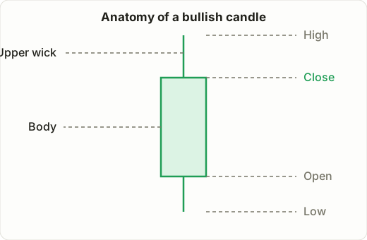
- Body: The thick part between the open and close. If the close is higher than the open, it's a bullish candle (commonly shown as green or, on some Korean platforms, red — colors vary by platform). If the close is lower than the open, it's a bearish candle.
- Wick (or shadow): The thin lines extending above and below the body, showing how far the price traveled during that period before pulling back.
💡 Color conventions vary by platform. Korean brokerage apps often show gains in red and losses in blue, while US platforms typically show gains in green and losses in red. Whenever you're using a new platform, check the color legend first.
What the Body and Wick Tell You
Even with the same open and close, wildly different wick lengths tell a completely different story about the "tug of war" that happened during that period.
- Long body, short wicks: One side (buyers or sellers) was firmly in control the entire time.
- Small body, long wicks: One side pushed hard, only to get pushed back by the other side. A long lower wick near a low is often read as "buyers stepped in aggressively from below and defended the price."
Common Candlestick Patterns
Doji
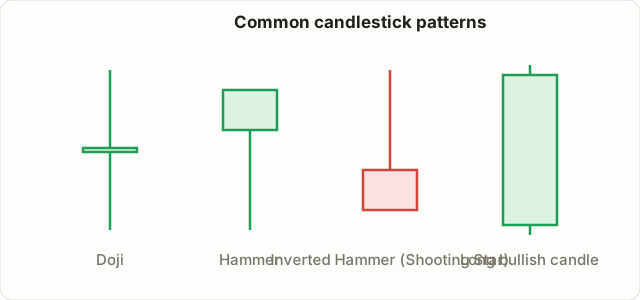
A candle where the open and close are nearly identical, so the body looks like a thin cross (+). It signals a tug of war where buying and selling pressure roughly canceled out, and is sometimes interpreted as a hint of a trend reversal.
Hammer
A candle with a small body and a lower wick at least twice the length of the body. When it appears at the end of a downtrend, it's read as "strong buying pressure came in at the low and pushed the price back up" — a hint of a possible bounce.
Inverted Hammer / Shooting Star
The mirror image of a hammer — a long upper wick with a small body sitting near the bottom. The interpretation depends on where it shows up (top of an uptrend vs. bottom of a downtrend); when it appears at the top of an uptrend, it's read as "strong selling pressure showed up at the high," hinting at a potential reversal down.
Long Bullish / Long Bearish Candle
A candle with a noticeably longer body than usual, showing that strong buying (long bullish candle) or strong selling (long bearish candle) pressure dominated that period.
A Word of Caution on Candlestick Patterns
⚠️ Never make a trading decision based on a single candlestick pattern alone. A hammer appearing doesn't guarantee a bounce, and a doji appearing doesn't guarantee a reversal. Treat candlestick patterns as hints that raise the probability of something happening — not standalone trading signals. Real decisions should combine them with trend, volume, and support/resistance levels. We'll cover these combinations in more depth in the strategies course.
Patterns That Span Two Candles, Not Just One
Everything so far has been about judging a single candle. In practice, patterns that look at the relationship between two consecutive candles are just as widely used.
Engulfing
A pattern where the next candle's body completely swallows the previous candle's body. If a small bearish candle at the end of a downtrend is followed by a much larger bullish candle whose body fully covers the previous one, it's called a bullish engulfing pattern, read as a sign buyers have overwhelmed sellers. The reverse — a large bearish candle fully covering the prior bullish candle at the top of an uptrend — is a bearish engulfing pattern.
Harami
The mirror image of engulfing: a large candle followed by a small candle that sits entirely within the first candle's body. It suggests that strong momentum has suddenly stalled, hinting the trend may be pausing to catch its breath, or possibly reversing.
💡 Two-candle patterns are often considered somewhat more reliable than single-candle patterns, because they let you observe a shift in strength across two points in time rather than one. Even so, as emphasized in the previous section, don't trade on these alone — combine them with trend and volume.
Choosing a Chart Timeframe
The same stock can look completely different depending on whether you're looking at a 1-minute, 5-minute, daily, or weekly chart.
- Short timeframes (1–15 minute candles): Used for short-term/day trading; noisy, and require frequent decision-making.
- Long timeframes (daily–weekly candles): Used for medium/long-term investing; good for spotting the big-picture trend.
For beginners, it's generally recommended to first identify the overall trend on the daily chart, then, if needed, zoom into a shorter timeframe to fine-tune your entry timing.
Summary
- Each candle packs four pieces of information — Open, High, Low, Close (OHLC).
- The body spans open-to-close; the wicks mark the high/low extremes of that period.
- Patterns like the doji and hammer are hints, not standalone trading signals.
- The same stock looks different at different timeframes, so choose a timeframe that fits your trading style (short-term vs. long-term).
In the next lesson, we move from charts to a company's actual numbers — the basic financial statement metrics.