Stock Basics · Lesson 70/89 · Advanced · 9 min read
What Is the Efficient Frontier? Markowitz's Theory of Optimal Asset Allocation
In this article
- "So What's the Exact Right Mix?"
- Why Mixing Two Assets Traces a Curve, Not a Line
- The Efficient Frontier: The Combinations That Give the Most Return for the Least Risk
- Add a Risk-Free Asset and Everything Changes: The Capital Market Line
- Just Two Funds Are Enough: The Two-Fund Separation Theorem
- Where Theory Meets Reality
- Takeaway
- FAQ
"So What's the Exact Right Mix?"
Correlation and Diversification covered how mixing two assets with low correlation can cut volatility while leaving expected return untouched. CAPM gave a formula for the expected return a single stock should command, given its beta. Both lessons quietly skip a question that sits one step earlier: out of every possible combination of assets, which one is actually "best" — and why does CAPM's "market portfolio" get such a special role in the first place? Harry Markowitz answered exactly that in 1952, and the centerpiece of the Modern Portfolio Theory (MPT) he built is the efficient frontier. The work eventually won a Nobel Prize in Economics, and it's the theoretical foundation underneath both CAPM and today's index-fund-centered investing culture.
Why Mixing Two Assets Traces a Curve, Not a Line
Start with the simplest case. Say Asset A has an expected return of 8% and volatility (standard deviation) of 15%, Asset B has an expected return of 12% and volatility of 25%, and the correlation between them is 0.2. Varying the weight between them produces the following:
| Weight A / Weight B | Portfolio Expected Return | Portfolio Volatility |
|---|---|---|
| 100% / 0% | 8.0% | 15.0% |
| 80% / 20% | 8.8% | 13.9% |
| 50% / 50% | 10.0% | 15.8% |
| 20% / 80% | 11.2% | 20.8% |
| 0% / 100% | 12.0% | 25.0% |
The key detail: expected return moves in a straight line with the weights (8% → 8.8% → 10% → 11.2% → 12%), but volatility doesn't. Moving from 100% A to an 80/20 mix actually raises expected return (8.0% → 8.8%) while lowering volatility (15.0% → 13.9%). That "free lunch" comes directly from the correlation being below 1 — the same mechanism covered in the correlation lesson. Plot every possible weight combination of these two assets on a return-vs-volatility chart, and instead of a straight line you get a curve that bows to the left. With dozens or hundreds of assets instead of two, that curve smooths out and the number of possible combinations effectively becomes infinite.
The Efficient Frontier: The Combinations That Give the Most Return for the Least Risk
Look at the table again and something interesting stands out. The 100% A portfolio (15.0% volatility) is worse in every way than the 80/20 mix (13.9% volatility, 8.8% return) — lower return and higher risk. There was never a good reason to hold 100% A. The same logic knocks out 90% A, 95% A, and every weight near it. The point in this example where volatility bottoms out (roughly 79% A, 21% B) is called the minimum-variance portfolio. Only the combinations from that point onward — where increasing B's weight raises both risk and return together — are actually worth considering. Any combination that gives lower return for the same risk, or higher risk for the same return, can simply be discarded.
The set of combinations satisfying "the highest expected return achievable at this risk level (or the lowest risk at this return level)" is what's called the efficient frontier. The segment of the curve below the minimum-variance point (in this example, weights above 80% in A) is technically on the same curve, but it doesn't belong to the efficient frontier. Real markets hold thousands of stocks, bonds, and commodities, so tracing a true efficient frontier means simultaneously adjusting the weights of all of them to find the best possible return at every risk level — a task no individual can realistically do by hand. In practice this requires numerical optimization software, but the underlying logic is identical to the two-asset example above.
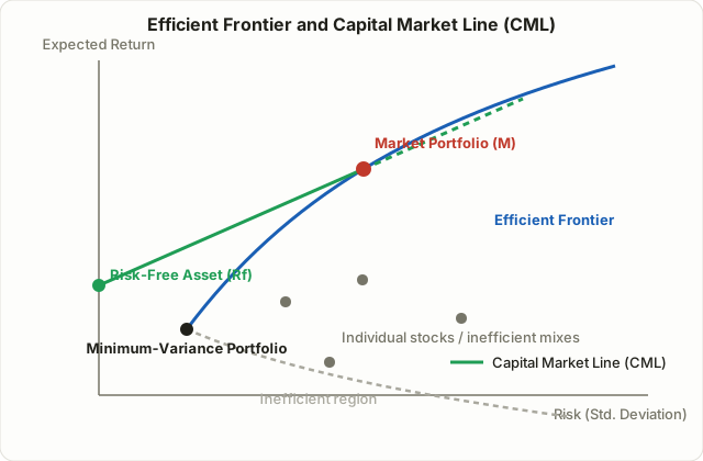
Generalize this to many assets and the picture above is what emerges. The gray dots are individual stocks or arbitrary combinations, and every one of them sits to the right of (or below) the curve — lower return for the same risk, or higher risk for the same return. Only the blue curve represents combinations achieving the best possible return at each risk level; holding anything not on that curve means a strictly better alternative theoretically exists.
Add a Risk-Free Asset and Everything Changes: The Capital Market Line
Now suppose you can also mix in a risk-free asset — a government bond, roughly speaking. Combining a risk-free asset with any single point on the efficient frontier produces not a curve but a straight line, because there's no correlation to account for when one leg of the pair carries zero risk — risk and return simply scale linearly with the weights.
Draw that line starting at the risk-free rate and tilt it upward until it just touches the efficient frontier at a single point, and that line sits above every other point on the curve at any given risk level. In other words, for the same amount of risk, a combination on this line always beats any combination on the curve. This line is the Capital Market Line (CML), and the single point where it touches the curve is called the tangency portfolio, or the market portfolio. In theory, this tangency portfolio is the one combination of risky assets that can't be improved upon any further.
Just Two Funds Are Enough: The Two-Fund Separation Theorem
This leads directly to a striking conclusion. Investors differ wildly in how much risk they're willing to take, but the answer to "how should the risky portion be allocated" turns out to be identical for everyone. A conservative investor and an aggressive one should both hold the exact same tangency portfolio in the risky-asset sleeve of their portfolio — the only thing that should differ between them is how much of their total money sits in that tangency portfolio versus the risk-free asset. Wanting more risk simply means shifting more weight toward the tangency portfolio, potentially even borrowing at the risk-free rate to push the weight above 100%. James Tobin, building on Markowitz's framework, formalized this as the two-fund separation theorem: a "risk-free fund" and a "tangency-portfolio fund" — just two funds — are enough to satisfy every investor's needs.
This is exactly the theoretical ground CAPM stands on. CAPM assumes that if every investor is looking at the same efficient frontier built from the same information, they'll all converge on the same tangency portfolio — and that portfolio, in aggregate, ends up matching the market-cap-weighted mix of every tradable risky asset in the economy (hence "the market portfolio"). It's also why a market-cap-weighted index fund, as covered in What Is an ETF?, is often treated as the closest practical proxy to "the theoretically optimal risky-asset mix," and why a common piece of allocation advice is to simplify the risky sleeve down to one broad index and spend your actual decision-making on how much cash or bonds to hold against it.
Where Theory Meets Reality
Markowitz's framework is elegant, but actually building this curve and trusting it runs into real obstacles.
First, the model assumes you know future expected returns, volatilities, and correlations with precision. In reality, all three have to be estimated from historical data, and optimal weights can shift dramatically depending on which time window you use — the assumption that "the future will resemble the past" is the weakest link in the whole chain. Second, as covered in the correlation lesson, correlations that look low in calm markets tend to spike toward 1 during a crisis — meaning the diversification the frontier promises can quietly disappear exactly when you need it most. Third, the model rests on a mean-variance framework that implicitly assumes returns behave close to a normal distribution, but real stock returns show more extreme crashes and rallies than a normal curve predicts — the well-known "fat tail" problem. Fourth, the Capital Market Line assumes anyone can borrow or lend freely at the risk-free rate, but individual investors can't actually borrow at government-bond rates, so the leveraged portion of the CML is more of a theoretical ceiling than something achievable in practice. Because of these limits, practitioners rarely apply raw Markowitz optimization output directly — they typically combine it with techniques that constrain or dampen the estimation error (adding artificial limits to the inputs, for instance). Institutional investors, too, generally don't rerun a Markowitz optimization every month and rebalance to the exact output; more often they borrow the theory's broad direction — spread risk across genuinely low-correlation asset classes, and avoid concentrating too heavily in any single one — as a guiding principle rather than a literal recipe.
Takeaway
- Mixing assets with correlation below 1 traces a curve that bows to the left on a return-vs-volatility chart, not a straight line — only the upper portion of that curve, offering the highest return for each risk level, is the efficient frontier.
- The leftmost point of the curve is the minimum-variance portfolio; segments offering lower return than that point are excluded from the efficient frontier.
- Adding a risk-free asset lets you draw a straight line (the Capital Market Line) from the risk-free rate tangent to the frontier; the tangency point is the market portfolio.
- The two-fund separation theorem says every investor should hold the same tangency portfolio and simply adjust the mix with the risk-free asset — this is the theoretical basis for both CAPM and index investing.
- Estimation uncertainty, correlations spiking in a crisis, fat-tail risk, and unrealistic borrowing assumptions all limit how literally this framework can be applied in practice.
FAQ
Can an individual investor actually calculate the efficient frontier?
With two or three assets, you can work through it by hand as in the example above. Once the number of assets grows, the correlation matrix becomes complex enough that you effectively need optimization software. For most individual investors, the more realistic takeaway is the underlying principle — mixing low-correlation assets bends the risk-return curve favorably — rather than plotting the exact curve.
Does the "market portfolio" just mean the S&P 500 or KOSPI?
The theoretical market portfolio is a hypothetical mix of every risky asset in the world — stocks, bonds, real estate, commodities — weighted by market value. A specific national or asset-class index like the S&P 500 or KOSPI only approximates a slice of that theoretical portfolio, so the two aren't strictly identical. In practice, though, a broad market index is commonly used as a stand-in for the market portfolio for the sake of calculation.
Does this mean an index fund plus cash is all I need?
That's the direction the two-fund separation theorem points in. But that conclusion rests on idealized assumptions — that every investor shares the same information and expectations, and that there are no taxes or transaction costs. In the real world, factors like tax treatment, an individual's specific cash-flow timing needs, or a deliberate view on certain factors (value, momentum, and the like) can make deviating from a pure index-plus-cash mix reasonable.
⚠️ This article is for informational purposes only and is not investment advice. You are solely responsible for your own investment decisions.