Trading Strategies · Lesson 64/64 · 9 min read
Liquidation Heatmap Trading: Using Open Interest to Read Cascade Risk and Liquidity Magnet Zones
In this article
- The Map Every Crypto Trader Keeps Open
- Why Liquidations Happen, and Why They Cluster
- What the Heatmap Actually Shows — and What It Can't
- Liquidation Cascades: Why Dense Zones Behave Like a Magnet
- Three Ways Traders Actually Use It
- A Worked Example
- Liquidation Heatmap vs. Volume Profile: Both Show "Levels," on Different Evidence
- Limits and Caveats
- FAQ
- Summary
The Map Every Crypto Trader Keeps Open
As crypto perpetual futures markets have grown, one tool keeps coming up in trading chat rooms and charting dashboards more than almost anything else: the liquidation heatmap. Lesson 62 covered how perpetual futures let traders stack large amounts of leveraged exposure, and every one of those leveraged positions has a price at which the exchange will force it closed. A liquidation heatmap plots where that forced-closing volume is estimated to be clustered, using color intensity to show density — brighter or darker bands, depending on the platform, mark price levels where a larger amount of leveraged exposure is thought to sit. CoinGlass is probably the best-known example. This lesson covers how these heatmaps are actually built, why dense clusters seem to pull price toward them like a magnet, and — just as important — how to use that information without over-trusting it.
Why Liquidations Happen, and Why They Cluster
Opening a leveraged position on a perpetual future comes with a maintenance margin requirement. If price moves against the position enough that the unrealized loss breaches that maintenance margin, the exchange force-closes it at market. At 10x leverage, for example, roughly a 10% adverse move from entry (the exact distance depends on the exchange's maintenance margin rate and fees) is enough to reach the liquidation price. Higher leverage means a shorter distance to liquidation; lower leverage means a longer one.
The reason liquidation prices cluster rather than spreading evenly across the chart is that traders themselves cluster. A disproportionate share of positions get opened near recent swing highs and lows, round psychological numbers (Bitcoin at $100,000 is the classic example), and the starting points of sharp recent moves — and using similarly popular leverage levels. When a large batch of positions opens around the same price and leverage, their liquidation prices end up clustered in a similarly narrow band. That band is what traders mean by a liquidation cluster.
What the Heatmap Actually Shows — and What It Can't
This is the part worth being precise about: exchanges do not publish individual traders' position sizes or exact liquidation prices. A liquidation heatmap is not a record of real data — it's an estimate, built by combining several inputs:
- Open interest on each exchange and coin, and how it changes over time
- The price level at which open interest spiked (used as a proxy for where those new positions likely entered)
- Commonly used leverage tiers on major exchanges (positions cluster heavily around round multiples like 5x, 10x, and 20x)
- The sign and magnitude of the funding rate (persistently positive funding is read as a signal of heavy long positioning)
Combining these produces a probabilistic map — "there's likely to be a meaningful amount of liquidation volume sitting near this price" — not a verified count. Aggregating data across multiple exchanges adds further imprecision, since isolated versus cross-margin practices differ by venue and aren't fully captured in the model. The accurate way to read a heatmap is "this zone probably has more clustered liquidation exposure than its neighbors," never "hitting this exact price liquidates this exact amount."
Liquidation Cascades: Why Dense Zones Behave Like a Magnet
A liquidation cascade unfolds in a fairly mechanical sequence:
- Price moves in one direction and reaches the first liquidation cluster.
- The leveraged positions sitting in that cluster are force-closed with opposing market orders (long liquidations dump market sell orders; short liquidations dump market buy orders).
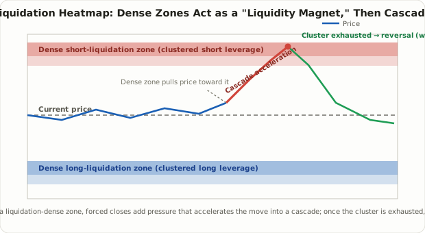
- Those forced orders consume order book liquidity and push price further in the same direction.
- That further move reaches the next cluster, and steps 2–3 repeat.
This feedback loop is why price tends to accelerate once it enters a dense liquidation zone, and why it can look like the zone is pulling price toward it — the origin of the "liquidity magnet" label. That phrasing can make it sound like the market is deliberately targeting a price, when what's really happening is a market-microstructure fact: a lot of forced buy or sell liquidity happens to be sitting at that level. It's also frequently argued that large traders and market makers are aware of this dynamic and sometimes push price toward a known cluster on purpose to trigger it before reversing — commonly called "stop hunting" or "liquidation hunting." That claim is directionally plausible but hard to verify case by case, since it depends on inferring intent rather than observing a mechanical fact.
Three Ways Traders Actually Use It
In practice, liquidation heatmaps get used in roughly three ways.
| Approach | Core idea | Caveat |
|---|---|---|
| Risk awareness (position management) | Check whether your stop or liquidation price sits inside a dense zone, and avoid placing it just inside one | The most defensible use — defensive, not predictive |
| Cascade-following (breakout style) | Once price breaks into a dense zone and a cascade starts, ride the move briefly in that direction | Entry is often late, hurting risk/reward, and the position can get caught in the reversal wick that follows |
| Post-exhaustion reversal (counter-trend) | Wait for the cascade to burn through the cluster, then fade the move once it reverses | Hard to confirm exhaustion in real time, and the cascade can carry straight into the next cluster instead of reversing |
Of the three, the first — using the heatmap purely for risk awareness — rests on the sturdiest logic. Placing a stop or a leveraged position's liquidation price just inside a dense cluster (where a small further move triggers a wave of forced closes) means sitting in the exact spot most likely to get run over if price does arrive there. Trading the cluster itself as a directional signal, in either direction, shifts into prediction — and inherits every limitation of a heatmap built on estimates rather than confirmed data.
A Worked Example
Say Bitcoin is trading at $92,000, and the heatmap shows a dense short-liquidation cluster forming near $96,000. That typically means a large number of traders opened shorts somewhere in the $92,000–$94,000 range using 5x–10x leverage, and their estimated liquidation prices cluster around $95,500–$96,500.
As price reaches $95,500, those shorts start getting force-closed with market buy orders. That buying pressure pushes price toward $96,500, which triggers the next layer of shorts in the cluster. Compressed into a window of seconds to minutes, this produces a candle far steeper than the recent average — a sharp spike wick around the $96,000 level. Once most of the cluster's exposure is burned through, the forced buying pressure disappears with it, and it's common to see price retrace back toward where it started. That retracement isn't guaranteed, though — if another cluster sits just above, the cascade can carry straight into it and push price considerably further before losing momentum.
Liquidation Heatmap vs. Volume Profile: Both Show "Levels," on Different Evidence
Lesson 12 covered volume profile and the point of control — another tool that highlights specific price levels, which makes it easy to conflate with a liquidation heatmap. The evidence behind each is fundamentally different.
| Liquidation Heatmap | Volume Profile | |
|---|---|---|
| Underlying data | Estimated liquidation prices, inferred from open interest and leverage assumptions | Actual executed trading volume — a historical fact |
| Nature of the signal | A forecast of where forced-closing volume might sit in the future | A confirmed record of where trading already happened |
| Effect on price | Tends to accelerate price further into the zone once reached (cascade) | Tends to act as support/resistance, drawing price back to revisit it |
| Typical market | Highly leveraged crypto perpetual futures | Any market with meaningful volume data — stocks, futures, crypto spot |
| Data reliability | Estimated (exchanges don't publish individual liquidation data) | Measured (exchanges publish actual trade data) |
Volume profile is a support/resistance concept grounded in "a lot of trading already happened here." A liquidation heatmap is an acceleration/magnet concept grounded in "forced closes are likely to concentrate here in the future." Treating the two the same way — as if both were static support/resistance lines — misreads what each one is actually telling you.
Limits and Caveats
- It's fundamentally an estimate. As covered above, a liquidation heatmap is reconstructed from open interest changes and assumed leverage distributions, not individual position records. Real liquidation volume and price can diverge from the map.
- Cross-exchange aggregation is imperfect. Combining data across venues can't fully account for differences in isolated vs. cross-margin practices or how each exchange computes its index price.
- It can become a self-fulfilling — or exploitable — signal. As liquidation heatmaps became widely watched tools, the possibility that larger players deliberately trade against or through visible clusters (adding liquidity on the far side, or using spoofing-style orders to nudge price toward one) can't be ruled out.
- It's not a standalone signal. A liquidation heatmap is a supporting tool for risk awareness and understanding market microstructure — not a substitute for trend, volume, funding rate, or news context. Betting directionally on a heatmap alone is not something this course recommends.
FAQ
Can I trade purely off a liquidation heatmap?
That's not recommended. The heatmap is an estimate, and reaching a dense zone doesn't guarantee a cascade or a reversal will follow. It's safest used alongside other evidence — trend, volume, open interest changes — and especially as a check on where you place stops.
Does this concept apply to stock markets too?
Margin calls and forced liquidations in stock margin accounts play a conceptually similar role, but stock markets use much lower leverage and don't have an open-interest concept in the same sense, so building a comparably precise heatmap isn't feasible there. This is really a tool built for — and specific to — leveraged crypto perpetual futures markets.
Is a liquidation cascade the same thing as a short squeeze?
They're related but not identical. Lesson 23 covered short squeezes, which are usually framed around short interest in the underlying equity. A liquidation cascade originates specifically from forced closes in leveraged derivatives. Both share the same underlying feedback loop — a position moving against its holder gets forcibly unwound, adding pressure in that same direction — but the mechanics and the markets they occur in differ.
Summary
- A liquidation heatmap visualizes, by color intensity, where forced-closing volume is estimated to cluster at various price levels, based on open interest and assumed leverage distributions — it is an estimate, not measured data.
- When price reaches a liquidation cluster, forced closes add directional pressure that produces a cascade, and this feedback loop is why dense zones appear to pull price toward them like a "liquidity magnet."
- The most defensible practical use is risk awareness — avoiding stops or liquidation prices placed just inside a dense zone — rather than treating the zone as a directional trade signal.
- Unlike volume profile, which reflects confirmed past trading activity and behaves like support/resistance, a liquidation heatmap reflects a forecast of future forced closes and behaves more like an acceleration point.
- Given the estimation error, cross-exchange data gaps, and the possibility of the signal being exploited, a liquidation heatmap is best treated as a supporting tool used alongside other evidence, not a standalone trading signal.