Trading Strategies · Lesson 26/57 · 10 min read
Relative Rotation Graph (RRG) Sector Rotation Strategy: Reading Capital Flow Through Four Quadrants
In this article
- Comparing Every Sector's Strength and Direction on One Screen
- The Two Axes: RS-Ratio and RS-Momentum
- What the Four Quadrants Mean
- Why It Works: Capital Can't Be Everywhere at Once
- The Strategy: Which Quadrants to Buy, Which to Avoid
- A Simplified Worked Example
- RRG Rotation vs. Weinstein Stage Analysis: How They Differ
- FAQ
- Limitations and Caveats
- Summary
Comparing Every Sector's Strength and Direction on One Screen
Lesson 20's Stan Weinstein's Stage Analysis tracks a single stock's relative strength line against a benchmark, one chart at a time. But real portfolio decisions rarely stop at one stock — the actual question is closer to "is semiconductors strong right now, or weak? What about financials? Healthcare? Energy?" Instead of opening a separate chart for every sector, the Relative Rotation Graph (RRG) plots the relative strength of many sectors (or stocks, or asset classes) against a benchmark on a single coordinate plane, all at once — and shows not just where each one sits, but how fast it's moving and in which direction.
The RRG was developed around 2004-2005 by Dutch analyst Julius de Kempenaer and was later licensed into major charting platforms including StockCharts.com, where it became a standard tool for both institutional and retail traders tracking capital flow. It was originally built to track rotation among the eleven S&P 500 sectors, but today it's used just as often to compare individual stocks, country indices, bonds, commodities, and even crypto assets against one another.
The Two Axes: RS-Ratio and RS-Momentum
Every sector on an RRG shows up as a single dot, and two indicators determine where that dot sits.
- JdK RS-Ratio (X-axis, relative strength): the sector's price divided by the benchmark's price, normalized around a value of 100. Above 100 means the sector has outperformed the benchmark over the recent lookback window; below 100 means it has underperformed.
- JdK RS-Momentum (Y-axis, momentum): the rate of change of that RS-Ratio itself — how fast relative strength is accelerating or decelerating. Above 100 means relative strength is strengthening; below 100 means it's weakening.
Multiplying the two axes together produces four quadrants around the center point (100, 100), and each sector traces a path — a "tail" — across that plane over time. Most platforms display roughly 8 to 15 weeks of trailing history alongside the current dot, so you see not just where a sector sits today but where it's been heading.
💡 The exact double-smoothing formula behind RS-Ratio and RS-Momentum varies slightly across platforms and isn't published as one fixed universal standard. The explanation below uses a simplified approximation to build intuition for the mechanism — in practice, almost everyone relies on the value a charting platform (TradingView, StockCharts, etc.) computes automatically rather than calculating it by hand.
What the Four Quadrants Mean
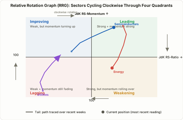
| Quadrant | Position | Relative Strength | Momentum | Interpretation |
|---|---|---|---|---|
| Leading | Upper-right | Above 100 | Above 100 | Already outperforming, and that outperformance is still accelerating |
| Weakening | Lower-right | Above 100 | Below 100 | Still stronger than the benchmark, but that edge is starting to fade |
| Lagging | Lower-left | Below 100 | Below 100 | Underperforming, and the underperformance is still deepening |
| Improving | Upper-left | Below 100 | Above 100 | Still underperforming overall, but the decline is slowing and momentum is turning up |
The textbook rotation pattern moves clockwise: Improving → Leading → Weakening → Lagging → back to Improving. This isn't a coincidence — it follows the natural logic of a market cycle. A sector bottoms out while still lagging (Improving), then actually starts outperforming as fundamentals and flows turn favorable (enters Leading), that outperformance eventually gets overextended and profit-taking sets in (Weakening), and it finally slips back below the benchmark (Lagging) before the cycle repeats.
Why It Works: Capital Can't Be Everywhere at Once
RRG earns its keep not because it's a mystical predictive tool, but because of a much simpler fact: the pool of capital chasing returns at any given moment is finite. In both bull and bear markets, sectors never all move at exactly the same speed. At any point in time, business-cycle stage, interest-rate direction, earnings season, and policy shifts push capital toward specific industries and away from others — this is exactly what "sector rotation" describes, and it echoes the classic business-cycle framework where early-recovery favors financials and consumer discretionary, expansion favors technology and industrials, late-cycle favors energy and materials, and contraction favors staples and utilities.
Institutional allocators watch this rotation closely and rebalance portfolio weights accordingly. Because moving large amounts of capital from one sector to another takes time, that shift often shows up first as a change in RS-Ratio and RS-Momentum — before it's obvious in absolute price. In other words, RRG is an attempt to capture where relative strength is concentrating ahead of where absolute price ends up going. A sector whose price is rising in absolute terms but rising slower than the benchmark is, relatively speaking, losing capital; a sector falling less than the benchmark is, relatively speaking, being defended.
The Strategy: Which Quadrants to Buy, Which to Avoid
The core idea behind RRG-based sector rotation is simple: increase exposure to sectors sitting in, or heading toward, the Improving and Leading quadrants, and reduce exposure to sectors sitting in, or heading toward, the Weakening and Lagging quadrants.
- Improving: still underperforming overall, but momentum is turning. Some traders treat this as an early-entry zone. That said, a sector can enter Improving and then curl straight back down into Lagging without ever reaching Leading — a "false improving" rotation — so it's worth confirming with an actual price low being taken out on the raw chart, not the RRG alone.
- Leading: both relative strength and momentum are favorable, generally viewed as the safest zone to hold or add to a position. That said, a sector deep in the far upper-right corner of Leading has often already run a long way, which is worth factoring into sizing.
- Weakening: still stronger than the benchmark, but momentum has started to roll over. This is commonly read as a signal to trim or take profits rather than add new exposure.
- Lagging: both relative strength and momentum are weak — generally a zone to avoid for new buys. That said, a tail that starts curling upward (toward Improving) while still inside Lagging can be an early clue that a bottom is forming.
A practice frequently cited by experienced RRG users — worth flagging explicitly as a rule of thumb, not a rigid rule — is to use the weekly RRG to set the broad direction (which sectors to overweight or underweight) and a daily RRG or the raw price chart to fine-tune entry and exit timing. The weekly view filters out noise and shows the larger rotation cleanly; the daily view is where you look for a specific pullback or breakout to actually act on.
A Simplified Worked Example
Instead of the full double-smoothing formula, here's a simplified numeric walkthrough of the core idea. Suppose a semiconductor sector index and its benchmark index closed over four weeks as follows.
| Week | Semiconductor Index | Benchmark Index | Relative Strength Ratio (sector ÷ benchmark × 100) |
|---|---|---|---|
| Week 1 | 1,000 | 1,000 | 100.0 |
| Week 2 | 1,030 | 1,010 | 102.0 |
| Week 3 | 1,065 | 1,015 | 104.9 |
| Week 4 | 1,110 | 1,020 | 108.8 |
The relative strength ratio itself has climbed above 100 and kept rising for four straight weeks, so this sector is moving rightward (stronger) along the RS-Ratio axis. Looking at the week-over-week gain — 2.0 → 2.9 → 3.9 — the rate of increase is also accelerating. Because both relative strength and the speed at which it's rising are increasing together, this sector's tail is moving strongly toward the Leading quadrant. If instead the ratio stayed above 100 but the weekly gain decelerated — say 3.9 → 2.5 → 1.0 — the same sector's tail would bend toward Weakening even though relative strength was technically still positive. In practice nobody recalculates this by hand every week; RRG widgets on TradingView, StockCharts, and similar platforms update it automatically.
RRG Rotation vs. Weinstein Stage Analysis: How They Differ
Both techniques share the same relative-strength root, but they solve different problems.
| RRG Sector Rotation | Weinstein Stage Analysis | |
|---|---|---|
| What it compares | Many sectors/stocks side by side, all on one screen | One stock at a time |
| Core inputs | RS-Ratio (strength) + RS-Momentum (rate of change) | 30-week MA + RS line slope |
| How time is shown | A trailing tail visualizes recent direction | Sequential Stage 1-4 phase judgment |
| Where it shines | Spotting where capital is rotating right now, across a universe | Judging a single stock's long-term trend phase |
| Typical use | Adjusting sector ETF / industry weightings and rotation timing | Timing entry, hold, and exit on one position |
In practice the two are often combined in a top-down workflow: use RRG first to identify which sectors capital is currently favoring (Leading or Improving), then apply Weinstein's Stage Analysis to the individual stocks inside that sector to confirm which ones are actually breaking into a genuine Stage 2 uptrend before buying.
FAQ
Can RRG only be used for stocks?
No. Anything with price data comparable to a benchmark works — country indices, bonds, commodities, currencies, and crypto assets have all been plotted on RRGs. The one rule that matters is comparing like with like: mixing fundamentally different asset classes against one shared benchmark tends to produce a misleading picture.
Does the clockwise rotation always happen in a clean, predictable loop?
No. Clockwise rotation is a frequently observed tendency, not a physical law. Sectors regularly loop back and forth within the Leading quadrant without ever fully exiting it, or enter Improving and fail to reach Leading before curling back down into Lagging (the "false improving" pattern mentioned above). RRG shows a statistical tendency, not a guaranteed forward path.
Why does the choice of benchmark matter so much?
Because RS-Ratio is defined relative to a benchmark, changing the benchmark changes every dot on the chart. When comparing S&P 500 sectors, the S&P 500 index itself is the natural benchmark; when comparing individual stocks within one industry, that industry's ETF is usually the better benchmark. Picking a benchmark that actually matches your comparison universe is what makes quadrant placement meaningful in the first place.
Limitations and Caveats
- It's lagging by construction. Both RS-Ratio and RS-Momentum are built on smoothed values over a lookback window, so quadrant transitions on screen can trail the actual underlying shift in direction. A weekly RRG, in particular, is a direction-confirmation tool, not a precision-timing tool.
- Relative strength is not a guarantee of absolute return. A sector sitting in Leading can still lose money in absolute terms if the whole benchmark sells off hard — RRG tells you what's relatively better, not what's guaranteed to go up.
- A small comparison universe distorts the picture. If you're only comparing two or three sectors, quadrant placement becomes an artifact of that small sample rather than a meaningful signal. A broader universe — the standard eleven S&P 500 sectors, for example, or a similarly sized comparison group — produces more reliable relative comparisons.
- Pair it with actual price action. Don't trade off the RRG plot alone — confirm with real support/resistance breaks or volume shifts on the raw candlestick chart. The stop-loss discipline covered in Lesson 6's Risk/Reward Ratio and Money Management applies just as much to RRG-based rotation trades as to any other setup.
Summary
- The Relative Rotation Graph plots RS-Ratio (relative strength) on the X-axis and RS-Momentum (its rate of change) on the Y-axis, letting you compare the relative strength and direction of many sectors or assets on one screen at once.
- The plane splits into four quadrants — Leading, Weakening, Lagging, and Improving — and assets tend to rotate clockwise through them: Improving → Leading → Weakening → Lagging → Improving.
- That rotation exists because capital is finite: at any given time, sector rotation concentrates relative flows into some industries and away from others, tracking business-cycle and market conditions.
- The basic strategy is to overweight sectors in or heading toward Improving/Leading and underweight those in or heading toward Weakening/Lagging, commonly using a weekly RRG for direction and a daily chart for timing — a widely cited rule of thumb, not a rigid rule.
- RRG shares its relative-strength foundation with Weinstein Stage Analysis but solves a different problem — comparing many assets at once versus judging one stock's trend phase — which is why traders often combine the two in a top-down workflow.
- Clockwise rotation is a tendency, not a law; account for its lagging nature and the fact that relative strength doesn't guarantee absolute gains, and always pair it with price action and a defined stop.